Home page: Tells people about your whole business. Visitors can go anywhere.


I hope you enjoy reading this article. If you need support with SEO , Google Ads , Facebook Ads, or Landing Pages, click on the link.
You are spending money on Google Ads or Meta Ads. People are clicking. But your phone is not ringing, and your inbox is empty. Sound familiar?
In most cases, the ad is not the problem. The landing page is.
A landing page is the first page a visitor sees after clicking your ad, email, or social media post. It has one job: to get the visitor to take one action. That action could be filling a form, calling you, booking a site visit, or asking for a quote.
If your page does not do this job well, you lose leads and waste your ad budget.
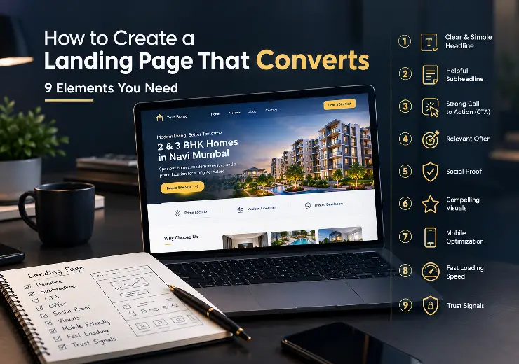
In this guide, we will explain how to create a landing page that converts. We will walk through 9 simple elements you need, share tips for real estate and business owners across India, and show you common mistakes to avoid. We keep the language simple, so you can use these ideas right away.
A landing page is a single web page made for one goal. Unlike your home page, it does not have many menus, links, or distractions. It shows one offer and one action.
Here is a simple way to see the difference:

Home page: Tells people about your whole business. Visitors can go anywhere.
Landing page: Talks about one offer. Visitors are guided to one action.
Why does this matter? Because focus brings results. When a visitor has fewer choices, they are more likely to act. A good landing page can bring you more leads from the same traffic, which means a lower cost per lead and a better return on your marketing spend.
The "conversion rate" is the number of people who take your action, divided by the number of people who visit. If 100 people visit and 5 fill the form, your landing page conversion rate is 5%. Our goal is to push that number up.
A landing page converts when it answers three questions fast:
What are you offering?
Why should I care?
What should I do next?
If any answer is unclear, people leave. It is that simple. Good design helps, but a clear message matters more. Now let us look at the 9 elements that bring these answers together.
Your headline is the first thing people read. You have only a few seconds to show them they are in the right place.
Keep it clear, not clever. Tell people the main benefit. Avoid big words and vague lines.
Weak: "Welcome to Our Premium Services"
Better: "Get a Website That Brings You 3x More Enquiries"
For real estate, a headline like "2 & 3 BHK Homes in Navi Mumbai, Starting at ₹65 Lakh" works well because it is specific. Use real facts you can prove. Big false promises hurt trust.
Tip: Match your headline with your ad. If your ad says "Free Site Visit," your page headline should say the same. This is a key part of any good Google Ads landing page.
The subheadline sits under the headline. It adds more detail. Use it to explain who the offer is for, how it works, or what makes you different.
For example: "We design fast, mobile-friendly websites for small businesses, so you get more calls and leads."
Keep it to one or two short lines. This small text clears doubts and keeps people reading.
The call to action is the button or link that asks people to act. Many pages fail here because the button says things like "Submit" or "Click Here." These words say nothing about the benefit.
Use action words that tell people what they will get:
"Get My Free Quote"
"Book My Site Visit"
"Download the Price List"
"Talk to an Expert Today"
Place your main CTA at the top of the page, where people can see it without scrolling. Then repeat it in the middle and at the bottom. Use a bright colour that stands out from the rest of the page. One page, one main CTA. Too many different buttons confuse people.
This is where many campaigns go wrong. If someone clicks an ad for "2 BHK flats near Panvel," they want to see 2 BHK flats near Panvel. They do not want a long story about your company.
The page must match the ad, the keyword, and the visitor's intent. When people see what they expected, they trust you and stay. When the page feels different from the ad, they leave in seconds.
A good offer also gives people a reason to act now. This could be a free consultation, a free site visit, a free audit, or a limited-time price. Make sure the offer is real.
People do not trust a new business easily, especially when they are about to share their phone number or spend money. Social proof lowers that fear.
Good types of social proof include:
Customer reviews with name and photo
Client logos
Number of projects completed or years of experience
Short case studies with real results
Google ratings and awards
Be specific. "Great service!" tells people very little. But "They helped us get 40 quality enquiries in the first month" tells a full story. Only use real feedback that you can show if someone asks.
Good landing page design is not about looking fancy. It is about helping people move through the page without effort.
Follow these simple rules:
Use plenty of white space so the page does not feel crowded.
Use big, clear headings and short paragraphs.
Pick two or three colours and stick to them.
Use real, high-quality images instead of dull stock photos.
Remove top menus and extra links that take people away.
Ask one question about every item on your page: "Does this help the visitor trust us or take action?" If not, remove it.
Most people in India browse on their phones. If your page takes too long to load, they will press the back button before they even see your offer.
Slow pages are often caused by heavy images, too many scripts, or cheap hosting. Here is how to fix it:
Compress your images before uploading.
Use modern image formats like WebP.
Remove plugins and scripts you do not need.
Use good, reliable hosting.
Test on a real phone, not just on a laptop.
You can check your speed for free with Google's PageSpeed Insights tool. It shows what is slowing you down and how to fix it. Also make sure buttons are big enough to tap and forms are easy to fill on a small screen.
Every extra field in your form is one more reason for people to leave. If you only need a name and a phone number to start a conversation, ask for just that.
That said, do not go too short if you get many low-quality leads. A real estate company may want to ask for budget or preferred BHK to filter serious buyers. Find a balance between the number of leads and the quality of leads.
Two small tricks help a lot:
Add a line below the form like "We will call you within 24 hours."
Add a small note like "Your details are safe with us."
These lines reduce worry and help more people finish the form.
People always have questions in their mind before they act. What is the price? How long will it take? Is there any hidden cost? What happens after I submit the form?
The best landing pages answer these doubts before the visitor has to ask. You can do this with a short FAQ section, a simple "how it works" section, or clear points about pricing and process.
When visitors find their answers on the page, they do not need to leave to look for them. And visitors who leave often do not come back.
| No. | Element | What It Does | Quick Tip |
|---|---|---|---|
| 1 | Clear headline | Tells visitors the main benefit | Match it with your ad |
| 2 | Subheadline | Explains who it is for and how it works | Keep it to 1–2 lines |
| 3 | Strong CTA | Tells people what to do next | Use action words, not "Submit" |
| 4 | Matching offer | Gives people what they clicked for | Keep the ad and page message the same |
| 5 | Social proof | Builds trust and lowers fear | Use real reviews and numbers |
| 6 | Clean design | Guides the eye to the CTA | Remove extra menus and links |
| 7 | Fast speed | Stops visitors from leaving | Compress images, test on mobile |
| 8 | Simple form | Makes it easy to share details | Ask only what you truly need |
| 9 | Answered doubts | Removes last-minute worries | Add a short FAQ section |
Real estate is a big-ticket decision. People take time, compare options, and need a lot of trust before they enquire. Here is how to adjust the 9 elements for property projects:
Show the location clearly. Add a map, and mention nearby railway stations, highways, schools, and hospitals. Buyers in cities like Mumbai, Pune, Bengaluru, Hyderabad, and Delhi NCR care a lot about connectivity.
Show real photos and videos. Use site photos, 3D walkthroughs, and sample flat videos. Real visuals build more trust than rendered images alone.
Put the price range up front. Mention the starting price and configurations (1, 2, 3 BHK). It saves time for you and the buyer.
List key amenities in simple points. Do not write long paragraphs. Use short lines or icons.
Add RERA details. Showing your RERA number builds trust right away and is a legal need in many cases.
Offer a site visit or a brochure download. These are low-pressure actions that fit how people buy homes.
Add a WhatsApp and click-to-call button. Many Indian buyers prefer to chat or call than fill a form.
If you are running Meta Ads for a new project, create a separate landing page for each campaign or offer. A page made for "ready-to-move flats" should not be the same as a page for "pre-launch offers."
If you run a service business, a startup, a clinic, a coaching centre, a finance company, or a local shop, the same ideas apply. A few extra points:
Speak your customer's language. If your buyers are mostly in a Tier 2 or Tier 3 city, think about adding a Hindi or regional language version.
Show your price or a starting range when you can. Hidden prices make people nervous.
Add trust badges, like GST registration, certifications, and payment safety marks if you sell online.
Keep your phone number clickable on mobile. Many leads come from a direct call.
Follow up fast. A landing page only brings the lead. The speed of your reply decides whether it turns into a customer.
Even good businesses make these errors. Check your page against this list:
Too many goals on one page. One page should have one main action.
A page that is too long without a clear structure. Long pages work, but only if they are easy to scan.
Weak or hidden CTA buttons. If people cannot find the button, they will not click it.
No mobile testing. Always check on both Android and iPhone
Asking for too much information. Long forms scare people away.
No tracking. If you do not track results, you cannot improve them. Set up Google Analytics and conversion tracking from day one.
Never testing or updating. A landing page is never "done." Test headlines, buttons, images, and offers over time.
At Ana Digital Media, we do not just build pages that look good. We build pages that bring leads. Our team has worked on many projects across real estate, finance and funding, and service businesses. We know what buyers look for, and we know how to turn clicks into real enquiries.
Here is how we can help:
Website and landing page development: Fast, mobile-friendly pages built for your goal.
Google Ads and Meta Ads lead generation: Campaigns and landing pages that work together.
SEO: Content and structure that help your pages rank on search engines.
Graphic design: Clean and eye-catching creatives that match your brand.
Social media marketing: Posts and reels that build your brand and bring in new customers.
We work with real estate developers, brokers, and business owners all over India. Whether you are launching a new project or growing a small business, we plan a clear path from the first click to the final enquiry. If you want to see how a stronger page can improve your ads, you can also read more about our website development services.
A landing page that converts is not about luck or fancy design. It comes from clear thinking and a few simple parts working together: a clear headline, a helpful subheadline, a strong CTA, a matching offer, real social proof, clean design, fast loading, a short form, and answers to common doubts.
If you get these 9 elements right, you will get more leads from the same traffic, spend less on each lead, and build more trust with your customers. Start with the basics, track your results, and keep improving step by step.
Whether you are a real estate developer launching a new project or a business owner who wants more enquiries, the right landing page can change your results.
Ana Digital Media can build a high-converting landing page and run ads that bring you real leads. Tell us about your business, and our team will suggest the best plan for you.
Contact Ana Digital Media today and let's grow your business together.


Let our experts turn your goals into real results.
ⓒ Copyright 2026 . All Rights Reserved By ANA Digital Media