A good-looking website always has one clear focus per page: If you cannot explain in one sentence what the visitor should understand and do here, the page is too complex.


I hope you enjoy reading this article. If you need support with SEO, Google Ads, Facebook Ads, or Landing Pages click on the link.
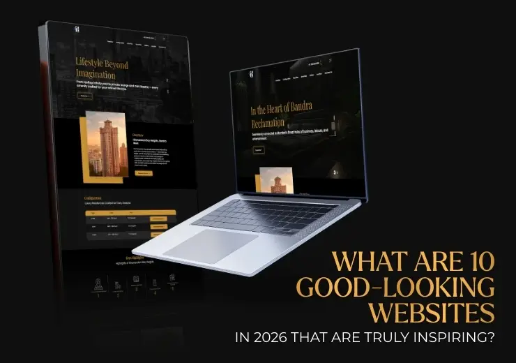
In 2026, a good-looking website means much more than just a sleek design or a striking homepage. The websites that truly inspire combine visual appeal with a clear structure, high speed, and a user experience that directly contributes to conversion and growth.
It is about a clear hierarchy, a sense of calm in the layout, strong typography, and content that both human visitors and AI search engines can understand effortlessly. In this article, we showcase 10 concrete examples of websites that demonstrate how modern web design, UX, SEO, and conversion come together.
A website in 2026 is only truly good-looking when the design demonstrably contributes to understanding, trust, and action. This is reflected in three concrete choices:
First: Visual hierarchy. Visitors must understand within three seconds what the page is about, what matters most, and where they can click. This is achieved through clear headings, sufficient white space, and a single primary focus per screen.
Second: Performance and mobile UX. Beautiful websites load instantly, feel smooth, and are designed with mobile-first usage in mind. If animations, fonts, or images compromise speed, the website immediately feels unprofessional.
Third: Structure that works for humans and AI. Content is built logically with recognisable sections, clear questions, and concrete answers. This allows visitors to scan faster and enables search engines and AI systems to interpret the content more effectively.
A website in 2026 doesn't just look good; it works visibly better because every design choice is functionally justified.
A good-looking website always has one clear focus per page: If you cannot explain in one sentence what the visitor should understand and do here, the page is too complex.
Structure and speed matter more than visual design: Clear headings, logical sections, and fast loading times make a website more pleasant and effective than extra visual effects.
Use inspiration to make choices, not to copy: Analyse what works on other websites and translate that to your own goals, target audience, and conversion path.
Design is only successful if it improves behaviour: Measure whether visitors understand faster, drop off less often, and take action more frequently. That is the true measure of a strong website in 2026.
Drawing inspiration from existing, proven websites delivers more than just following design trends because you learn from choices that already function in practice. This isn't based on taste, but on behaviour, conversion, and scalability.
Faster decision-making: You see immediately which page layout, navigation, and CTA structure work, reducing the need for experimentation during design or development.
Higher conversion rates: Proven websites show how attention is directed to one primary action per page, rather than distracting visitors with visual trends.
Better findability and performance: Strong examples combine design with logical heading structures, readable content, and fast loading times, which directly contribute to SEO and AI visibility.
Reduced risk during redesign: You avoid investing in styles that look modern but lead to lower conversions, poorer usability, or unnecessary technical complexity.
Clearer choices per website type: By comparing several good websites, you recognise what works universally and what is specifically suited for situations like B2B lead generation or e-commerce.
1. What does the website communicate within the first five seconds?
2. Which action is made to feel like the most logical next step?
3. How is trust built without needing lengthy explanations?
Apple.com shows that a good-looking website comes from extreme focus and discipline, not complexity. Each page is built around one core message and one primary action. This makes the site not just visually strong, but also exceptionally clear for visitors.
One message per screen: Apple avoids long blocks of text or multiple calls to action "above the fold." Each screen introduces one benefit or product feature, encouraging visitors to keep scrolling.
Visual hierarchy guides behaviour: Large headings, supporting visuals, and brief explanations ensure your eyes follow exactly what Apple wants you to see. This is a conversion strategy, not just an aesthetic choice.
Design supports performance: Despite large visuals, the website remains fast and stable. Images load smartly, and animations are functional, not decorative.
Consistent brand experience: Every page feels the same in terms of structure, typography, and tone of voice, which reduces cognitive load and increases trust.
What is the one message that must stick?
What action do I want the visitor to take next?
Which elements can I remove without weakening the message?
Stripe.com is a powerful example of how a website can look visually calm while explaining immense complexity under the surface. In 2026, Stripe proves that a good-looking website isn't about the simplicity of the product, but about the simplicity of the explanation.
Complexity is broken down into layers: Stripe never shows everything at once. The homepage remains clear, while in-depth information only becomes visible when the user is ready for it.
Design supports different audiences: Developers, marketers, and decision-makers all find their own entry point without the website feeling fragmented.
Typography as a UX tool: Stripe uses typography to indicate priority. Large headings for direction, short paragraphs for explanation, and subtle accents for details.
Conversion without pressure: Call to actions are present but never loud. They are positioned logically after an explanation, making clicking feel like a natural next step.
Reduce complex services to clear core questions.
Split explanations into overview, deep-dive, and detail.
Place CTAs only after the visitor understands the problem you solve.
Airbnb.com demonstrates how design, emotion, and ease of use come together without feeling forced. The website is entirely designed to quickly remove doubt while keeping the experience personal and inspiring.
Direct focus on the primary task: The homepage isn't about explanation; it's about action. Search is central, with zero distractions.
Emotion supports trust: Imagery is used to set expectations, not just as decoration. Users can "see" themselves at the destination.
Microcopy reduces friction: Small snippets of text near filters and forms remove uncertainty.
Consistent mobile experience: The mobile version isn't a stripped-down variant; it's the starting point.
Framer.com is a textbook example of how a website can feel modern without becoming restless or unclear. The site uses movement and interaction with a clear goal: to speed up explanation and hold attention.
Animation as a functional tool: Movement clarifies the relationship between elements, helping the user understand how the product works.
Clear structure despite visual dynamics: Headings, sections, and CTAs are always in predictable places.
Product as the protagonist: Framer shows the product in use, rather than relying on abstract promises.
Webflow.com shows how a website can simultaneously inform, inspire, and convert. It’s built on the idea that well-informed visitors convert faster.
Education as a conversion accelerator: Using explanations and use cases to remove barriers before asking for an action.
Modular page structure: Using reusable sections that follow a logical flow, keeping content organised.
Clear audience segmentation: Addressing different user types through clear navigation and structure.
Looking for a website that isn't just "pretty" but acts as a conversion engine?
Fully Bespoke Design tailored to your brand.
Conversion-Optimised for maximum business impact.
AI & SEO Ready for 2026 search visibility.
Linear.app proves that a good-looking website doesn't need much to be effective. Its power lies in extreme focus: everything that doesn't contribute to understanding or action is stripped away.
Radical focus on core functionality: Only showing what is necessary to understand the product's value.
Visual calm increases understanding: Plenty of white space and limited colour accents allow visitors to process information faster.
Predictable UX patterns: Navigation and interactions behave exactly as users expect.
Shopify.com is a strong example of building trust with a broad audience. It shows that good design is about clarity, recognition, and scalability.
Clear value proposition above the fold: Visitors don't have to search for relevance.
Design that grows with complexity: Simplicity for beginners and depth for advanced users coexist harmoniously.
Strong combination of proof and explanation: Strategic use of case studies and logos to remove doubt.
Awwwards.com is a great example of using creativity without losing the user. Despite its visual richness, the site remains functional and navigable.
Creativity within clear boundaries: Experimental layouts work because the base structure remains recognisable.
Balance between inspiration and usability: Users can scroll for inspiration or search specifically.
Visual hierarchy prevents chaos: Even with many visual stimuli, it's clear what is primary and what is secondary.

Patagonia.com is a prime example of a site that doesn't just sell, but communicates what the brand stands for. Design is used to build authenticity and long-term relationships.
Stories take priority over offers: Content and context come before product promotion.
Sober layout strengthens credibility: Avoiding "marketing tricks" in favour of a clean, honest look.
Consistent brand language: Imagery and text tell the same story across every page.
Notion.so shows how a versatile product can feel simple and inviting. The website is designed to pique curiosity without overwhelming the user.
Visual explanations lower entry barriers: Using illustrations to provide immediate context.
Modular content structure: Information is divided into small, recognisable blocks.
Design supports adoption, not just conversion: Focusing on long-term activation and usage.
These 10 examples show that successful websites in 2026 share striking similarities regardless of their industry.
Design is never an end in itself; it is a means to stimulate understanding, trust, and action. Every visual choice supports a clear goal, and anything that doesn't contribute is intentionally left out. Every page has one clear focus, guiding visitors to a logical next step.
Structure is more important than mere creativity. Clear headings, fixed patterns, and predictable navigation make it easier to process information. Finally, performance is key—fast loading times and a strong mobile experience define the overall feeling of quality.
Inspiration only becomes valuable when translated into concrete choices. Start with behaviour, not design. For every page, determine what the visitor needs to understand and what action should follow. If you can't describe it in one sentence, the page is too complex.
Critically review your content. Does a section add understanding, build trust, or help the visitor move forward? If not, it's noise. The best websites show that cutting often delivers more than adding.
Finally, ensure your structure is scanable. If you can understand the gist of the page just by reading the headings, you’re on the right track. This helps not just humans, but AI systems too. Measure your choices—look at scroll behaviour and drop-off points rather than just clicks.


Let our experts turn your goals into real results.
ⓒ Copyright 2026 . All Rights Reserved By ANA Digital Media